08/29/14 - Windsor
It took a very convincing school friend to push me into truly appreciating the importance of typography in our line of work. To him, I am grateful for recommending, Stop Stealing Sheep & find out how type works by Erik Spiekermann and E.M. Ginger. This was not recommended reading when I was in school but I am pretty sure it is now. I also remember secretly being so jealous of how he can spot and name a font in the streets of New York as if he was my personal “what da font?”
Fonts are the visual voice of design. Fonts have character, tone, rhythm, and class. A handful of fonts are immortal, others age gracefully, some define the period in which they were conceived and then there are one hit-wonders and the walking dead. To sound a bit more educated, fonts fall into specific classifications. There are the Humanistic typefaces, Garalde, Transitional, Didone, Slab and San serifs. If you're new to all this type talk, you might already be overwhelmed. In the beginning I certainly was. When I’m lost or feeling overwhelmed upon choosing the accurate visual voice, I always go back to the basics. So, let’s start with Humanistic typefaces. Some of the characteristics to remember about Humanistic typefaces are:

1. the slopping bar of the lowercase “e”2. short x-heights3. minimum variation between the strokes width4. in paragraph use, the overall hue is dark

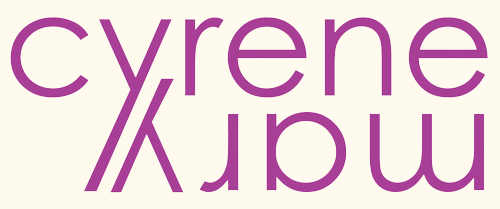
The book spine I’ve showcased today passes all three characteristics of a Humanistic typeface. Windsor, attracted me at a used bookstore in downtown Palo Alto, mainly because of the diagonal strokes of the uppercase letter “M”. This then lead me to the diagonal stress on the lowercase letter “e” which got me real excited to find this humanist typeface. That same diagonal stress can also be seen on the stem curve of the lowercase letter “a”. Overall, it has this very antique feel to it. Windsor is a typeface that would be used alongside posters and calendars during the Art Nouveau period.
Another fun-fact I learned today is that Woody Allen used Windsor in 36 of his films according to the article I read below.This makes me want to rent Woody Allen movies just to witness the appearance of Windsor, the humanistic typeface.
Further Readings: